
Exoprise Service Watch Desktop is the leading network Digital Experience Monitoring (DEM) platform for end user desktops, SaaS applications and ALL of Microsoft 365. Service Watch Desktop monitors system, browser, application and network performance for employees to ensure productivity and satisfaction with IT services. We call it Network DEM!
Service Watch Desktop provides complete coverage for Microsoft 365, third-party SaaS services, and desktop applications. Service Watch Desktop is easily installed across all or a subset of users within an organization.
Download or package an installer for Service Watch Desktop.
True Digital Experience Monitoring
Service Watch Desktop measures system, network, and application performance across the full spectrum of SaaS and business critical applications. Whether users are working from home, on the road, branch, or headquarters, ensuring proper user experiences is critical to business productivity and user satisfaction.
Service Watch Desktop is encrypted end-to-end and comes with configurable privacy and domain filters to ensure business critical information is collected.
Service Watch Desktop can be installed on a subset of users deployed through Active Directory or other Electronic Software Distribution methods and is capable of quickly delivering insight and results.
How To Get Started?
Service Watch is simple to get started with, just like the rest of Exoprise solutions.
- Create a Service Watch Desktop configuration and choose which Service Watch Browser configuration to associate.
- Once you save a Service Watch Desktop configuration, you’ll be able to send a link to any user where they can get started.
- We recommend you download and try it on your own machine, first, before deploying it or inviting users to install it.
You can invite anyone to install Service Watch Desktop and collect data on any domains and applications that you specify. Multiple Extension filters can be applied to Service Watch Browser setups and installations.
Who Should Run Service Watch Desktop
Selecting end-user candidates to run Service Watch Desktop can vary depending on what you are trying to do. Trying to diagnose application performance for end-users in remote locations or mobile users is a good starting point for Service Watch:
- Mobile or Remote Users
Service Watch is excellent for measuring the performance of cloud and custom applications from the end-user perspective, no matter where they are located. If you have end-users that telecommute or users that are on the go, invite them to install Service Watch extensions and configure it for their most critical Line of Business (LOB) apps. - Branch Office Users
If you have pro-users or administrators in branch offices, as well as knowledge workers that are dependent on apps like Office 365, SharePoint, OneDrive and more, then they are good candidates for installing Service Watch. - Users That Complain of Slow Performance
When you are troubleshooting slow performance or network problems for users, they can be great candidates for inviting to install the Service Watch extension and configuring domains for their critical sites and apps. - Try It With IT or Network Administrators
To get an early understanding of how Service Watch works, you should invite other IT personnel to set up the Service Watch extension for monitoring applications like Office 365, SharePoint, Service Now and more.
Service Watch Desktop Widgets
By deploying Service Watch Desktop, a dashboard will become available and provide you with visibility into the data collected. The Service Watch Desktop dashboard include three types of Widgets to make it easy to troubleshoot end users performance issues.
Service Watch Scorecard Widget
This scorecard widget is ideal for quick visualizations of specific metric for a single sensor or in aggregate across all sensors of a specific type. Choose and configure over a period of time to include in the tab.
Service Watch Scorecards are ideal for visualizing hardware performance trends for specific users machines, no matter where the user is located.
The scorecard color for the metric changes depending on the recent trend over the selected period of time.
- Green if the trend is less than a 5% increase
- Orange if the trend is between 5 and 10% increase
- Red if the trend is a greater than 10% increase
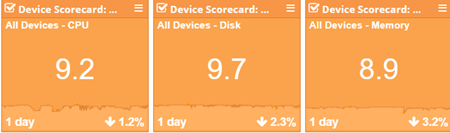
Visualize RUM Experience Scores for end user machines.
Service Watch Grid Widget
The Service Watch Grid widget is a powerful widget for visualizing tables of requests filtered by domain or user. Choose from different metrics with full sorting capabilities and spark lines for trend visualization over different time periods such as daily, weekly, monthly and more.
The Service Watch Grid widget enables quickly assessing the end user’s machine’s resource utilization. They can be customized to reflect CPU, Memory, Disk, Wi-Fi, and more. Service Watch collects the data every 30 seconds from the endpoint while actively being used.
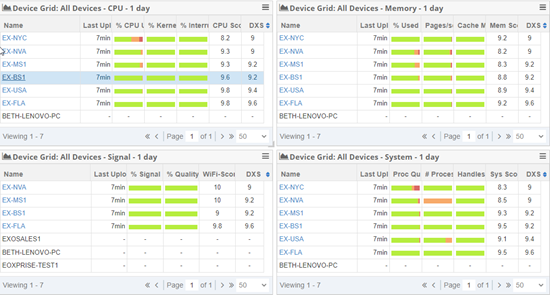
Visualize performance usage of end user machines
Service Watch Reliability Widget
Chart Windows Updates, Application Crashes, Installs, and Blue Screens. Add this widget and use the controls to select a trending metric and configure the time period for the graph.
Filter the data to visualize occurrences on the end users machines based on specific times and help troubleshoot issues or see any trends.
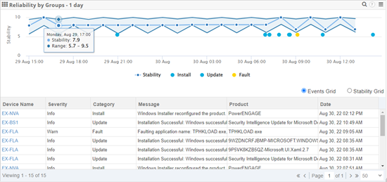
Graph out when critical items are happening on your end user machines.
Desktop Experience Score – DXS
The DXS or Exoprise Device Experience Score is an indicator of the overall health and performance of a user’s machine. The purpose of the DXS is to encapsulate Memory, Disk, CPU, Wi-Fi, and other performance metrics of the machine and application experiences.
This DXS should be an estimate of an end-user’s experience via their machines. A higher score between 8 and 10 indicates a machine running well. Lower scores indicate slower performance and therefore poorer experience.
Find Out More
Read more about Service Watch on the following pages: